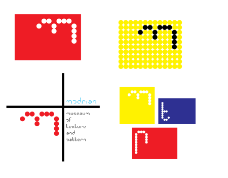
After going back to my sketchbook and choosing the name mondrian I sketched out a few ideas all based around mondrians art and I think they were much stronger than my initial ideas. I went through the same process as before and went onto illustrator to replicate my ideas. I think these ones did also work better digitally than the last as they were very modular which also worked with my font. All of them are below. Everyone agreed that that bottom right one looked the most effective but did need some more work. I also decided to edit my ‘m’ as a lot of people were saying it looked like an f on its side however I might edit it further still. I did decide to take people advice on the bottom right design and look at it in a few different ways. I did also really like the top left design because of its simplicity so I wanted to try and incorporate that into the stronger design.

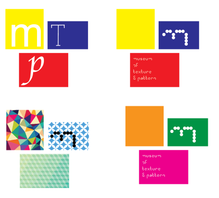
I played around with colour, pattern and font but I still believed that the primary colours and my own font worked the best. The patterns were too overwhelming and the different fonts just didn’t look strong enough. I did really love the layout involving the ‘museum of texture & pattern’ copy so i think i may use this. I did still really like some of my other designs so I think i’m going to take all of these forward just to see which ones worked the best in the poster format although I am leaning more towards this one.


